Branding/Logo design/Graphic design
A group of young musicians started a festival taking place in idyllic Arild, in the south of Sweden. With a successful first year for the festival 2022, they wanted to advance and establish their brand identity with the next festival coming up in July of 2023.
The visual identity included logos, color palette, fonts and typography, illustrative expression and usage of photography. The idea behind the colorful result came from studying the history and connotations to the village of Arild, as well as designing for establishment while still standing out amongst other, small festivals.
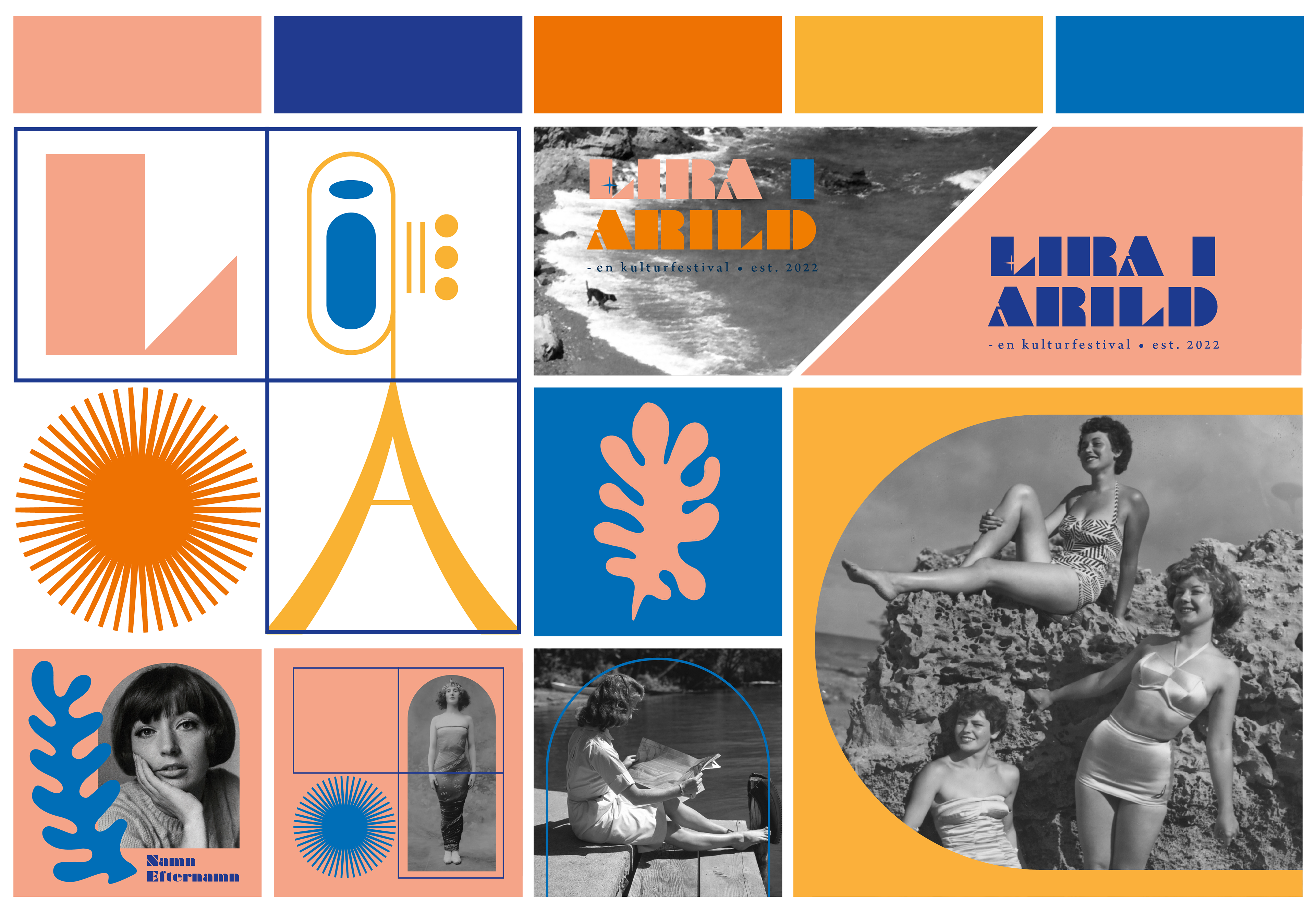
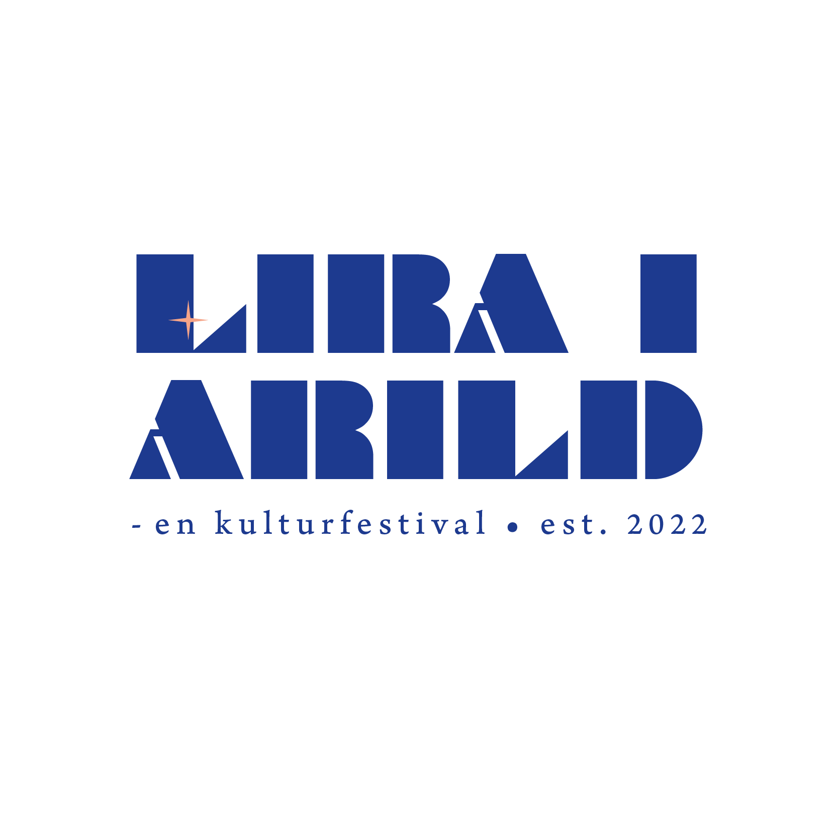
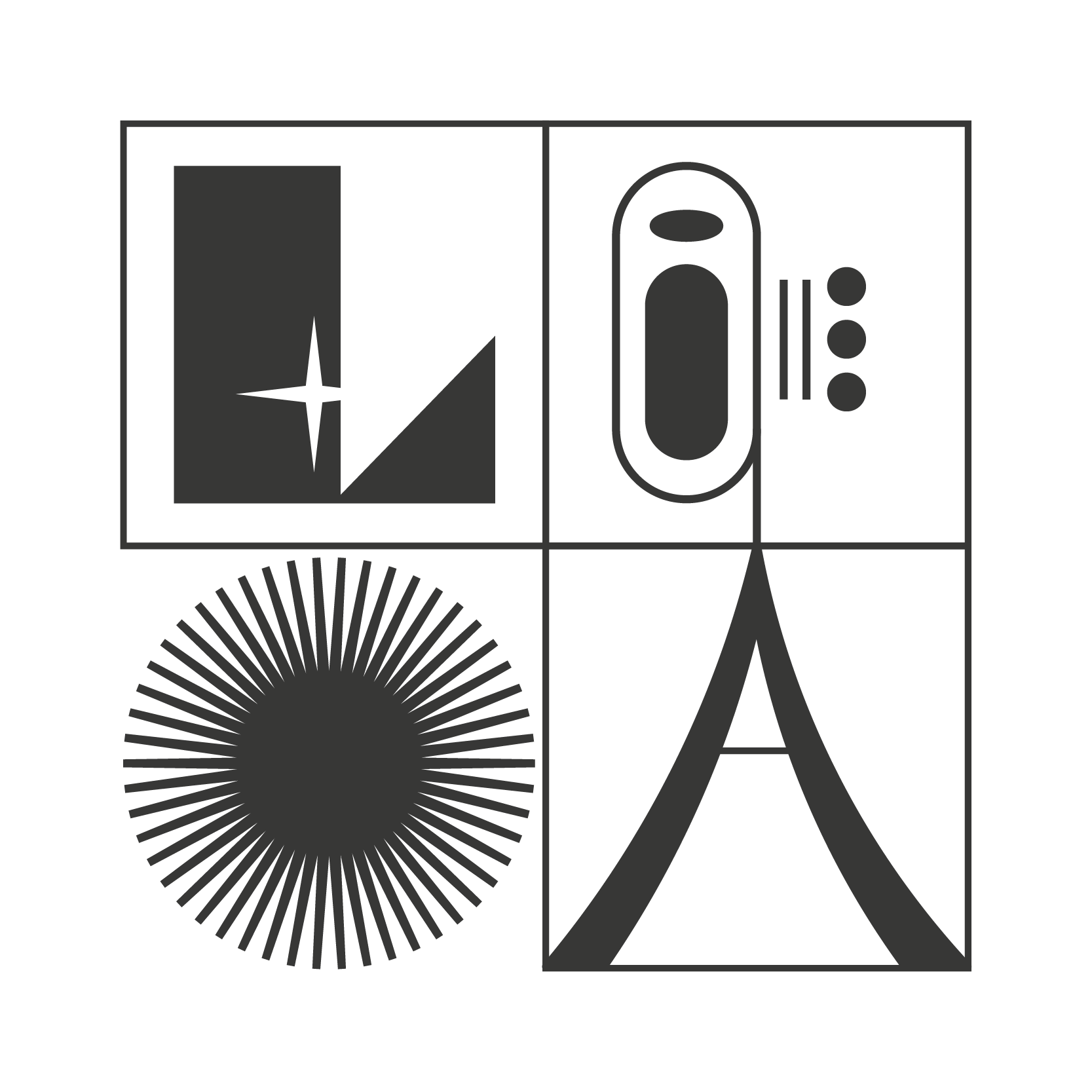
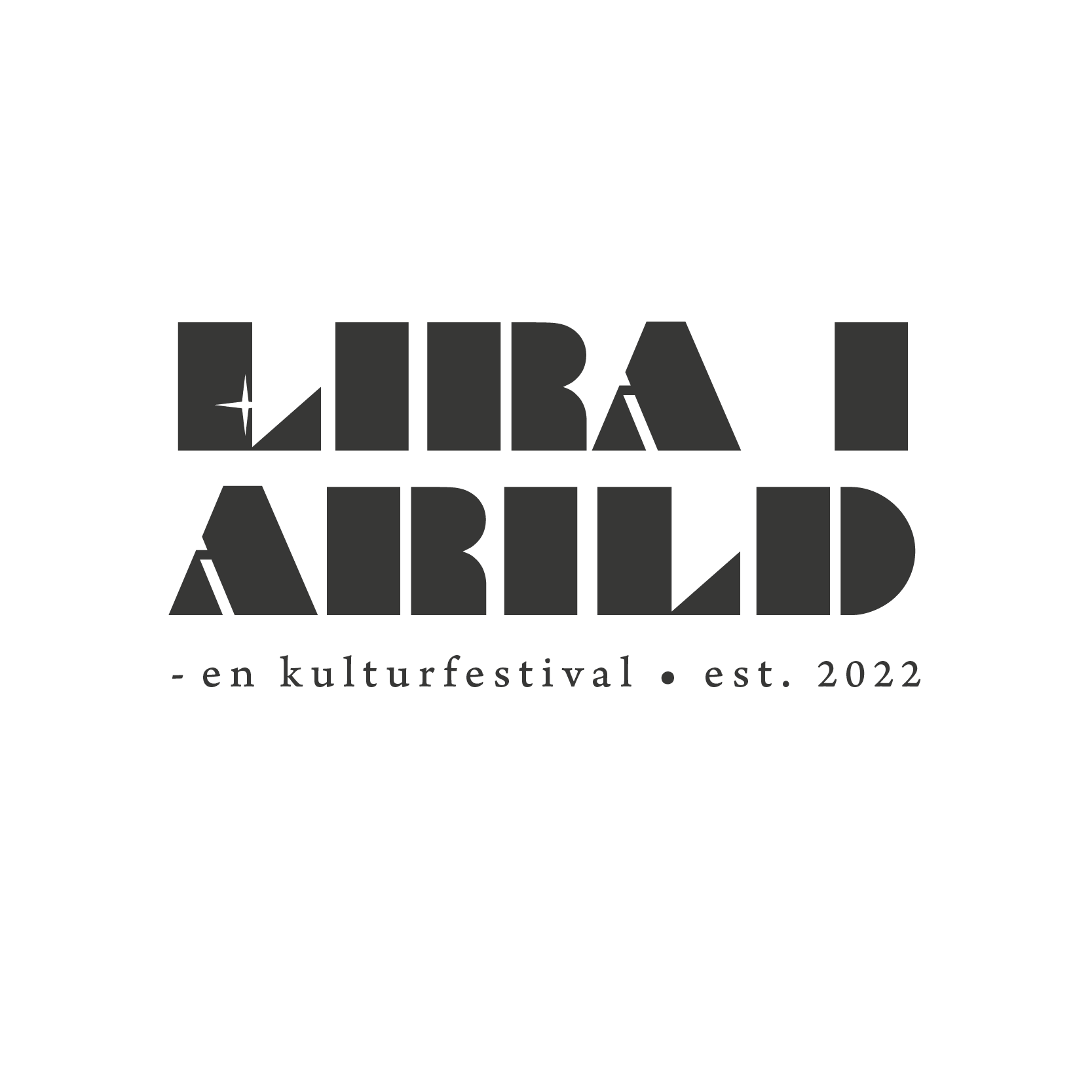
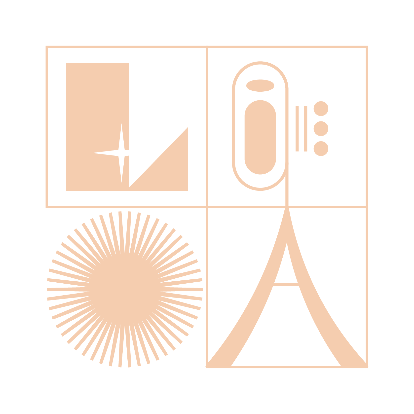
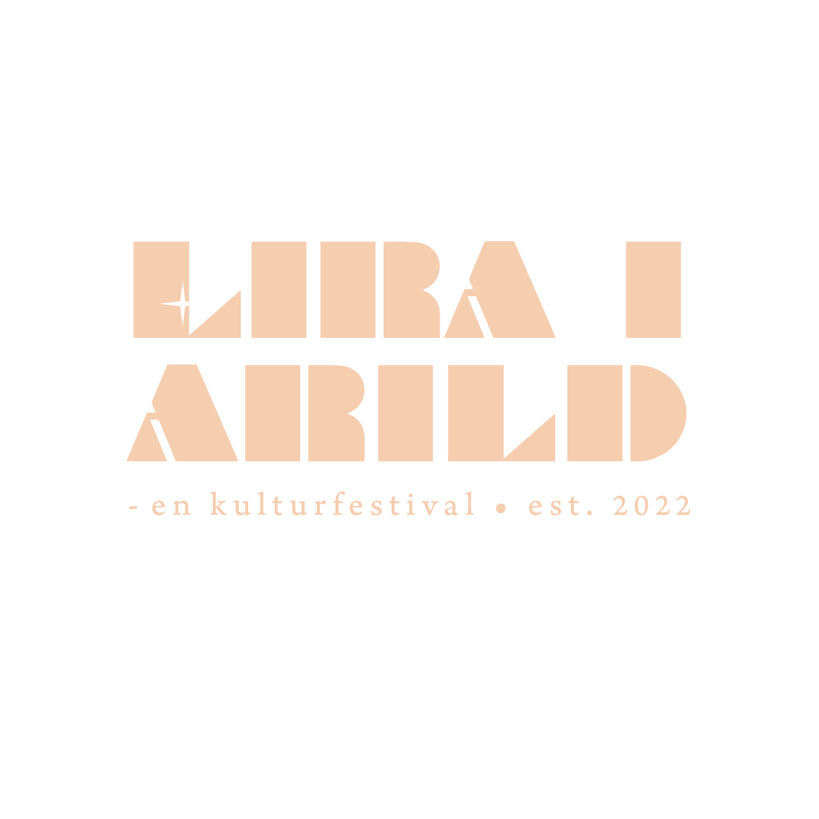
Logo
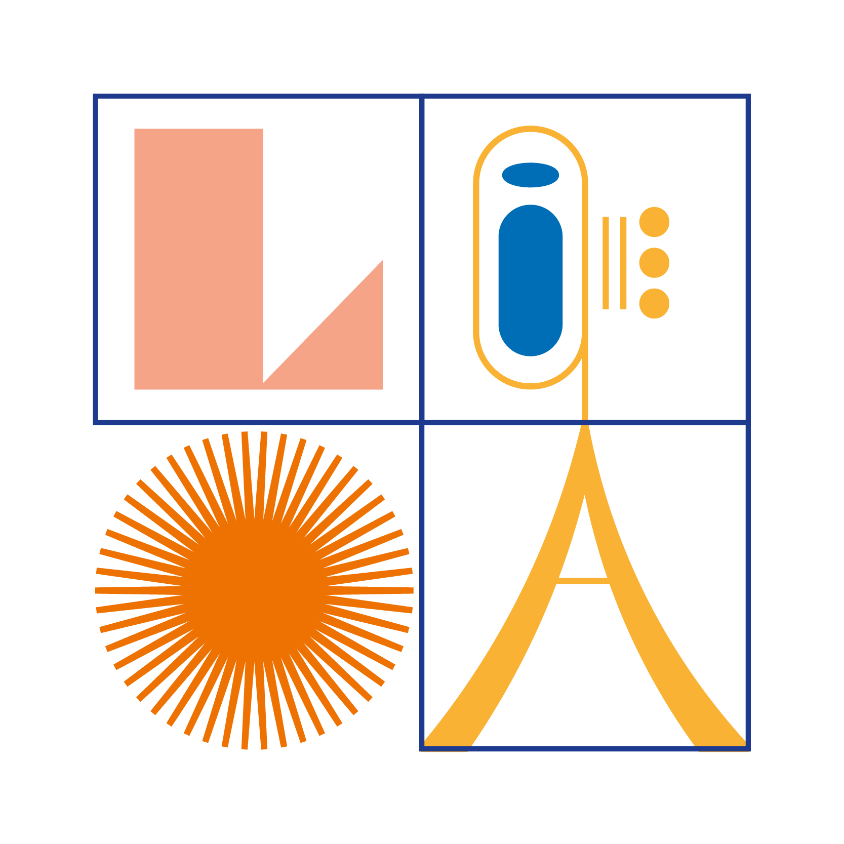
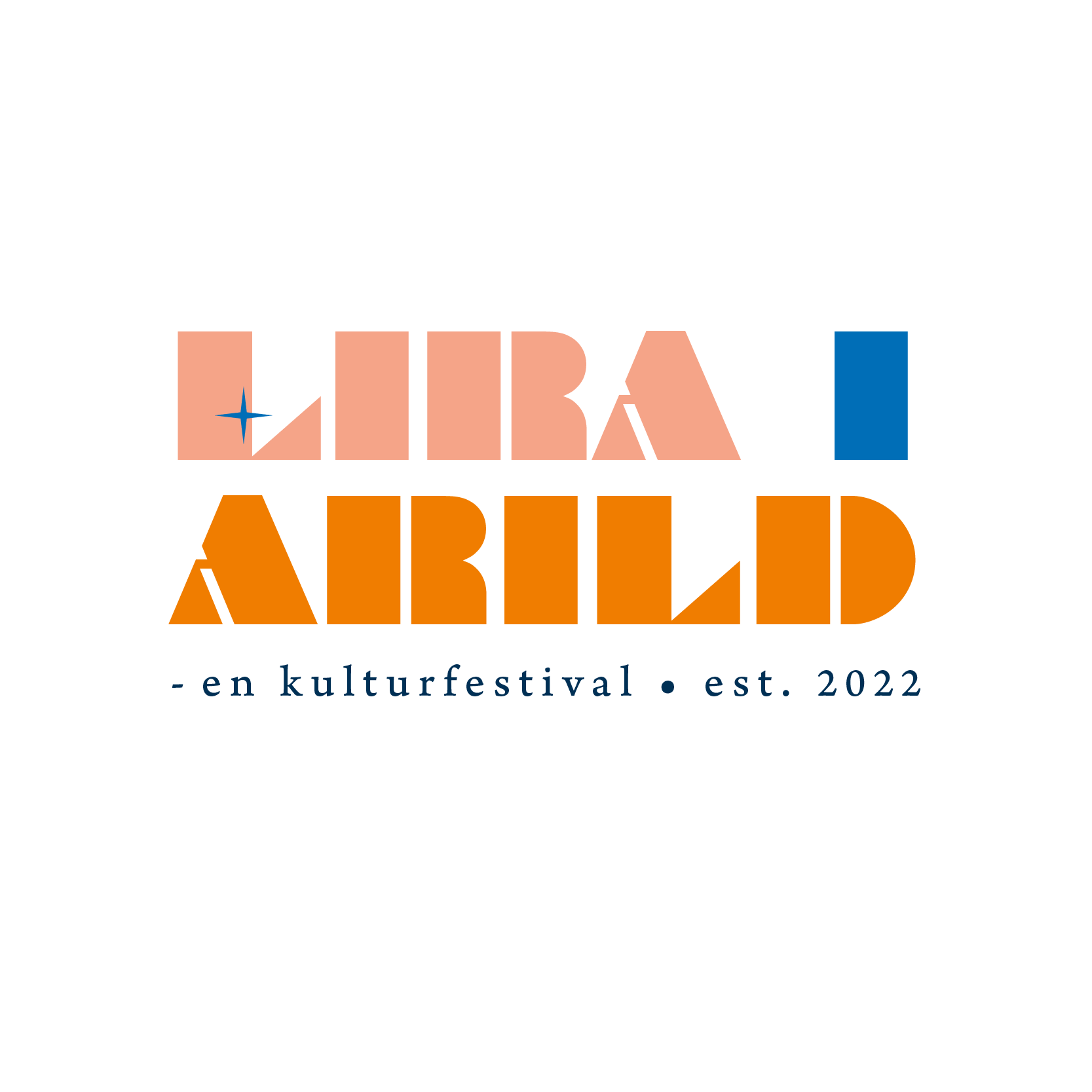
The main logo is in the upper left corner and contains 3 variations. The coral and blue groups are the primary logos, and the black and beige is accent logos. The main logo, the square containing squares and and sun, is meant to capture summer, playfulness, music and art. The "L" works as the first letter in the festival's name, but also illustrates the shoreline and the geographical placement of Arild. On the right side you can see a brass instrument playfully illustrating an "I" for "i" and "A" for Arild, and the recurrent number of 3 (squares and dots) represent the 3 founders of the festival.


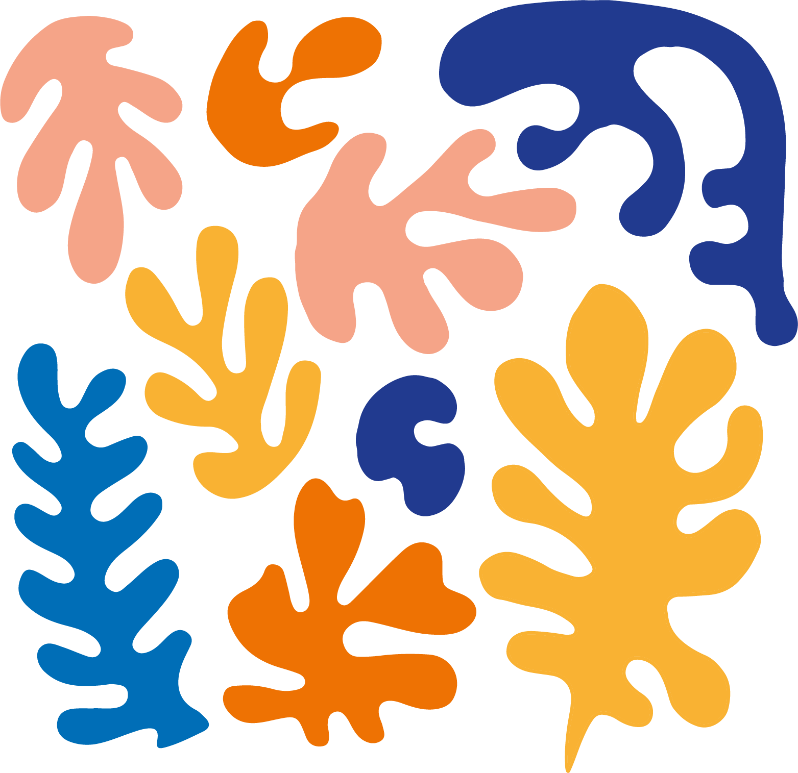
Shapes
The Henri Matisse-esque illustrative shapes is another fun part of the brand identity. The can be used for decorative purposes or as photo frames. The shape is inspired by seaweed and summer, once again flirting with the surroundings of the village Arild.
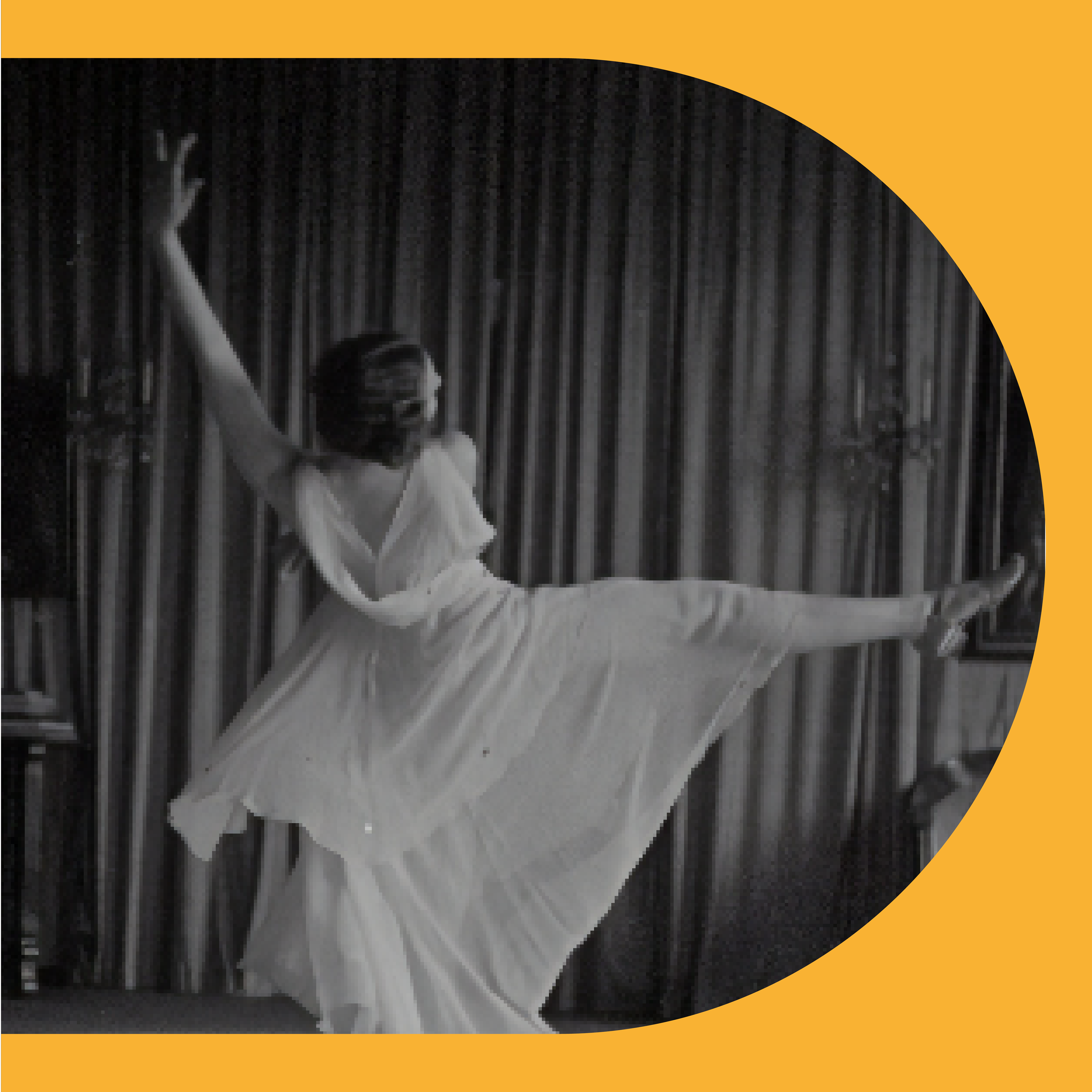
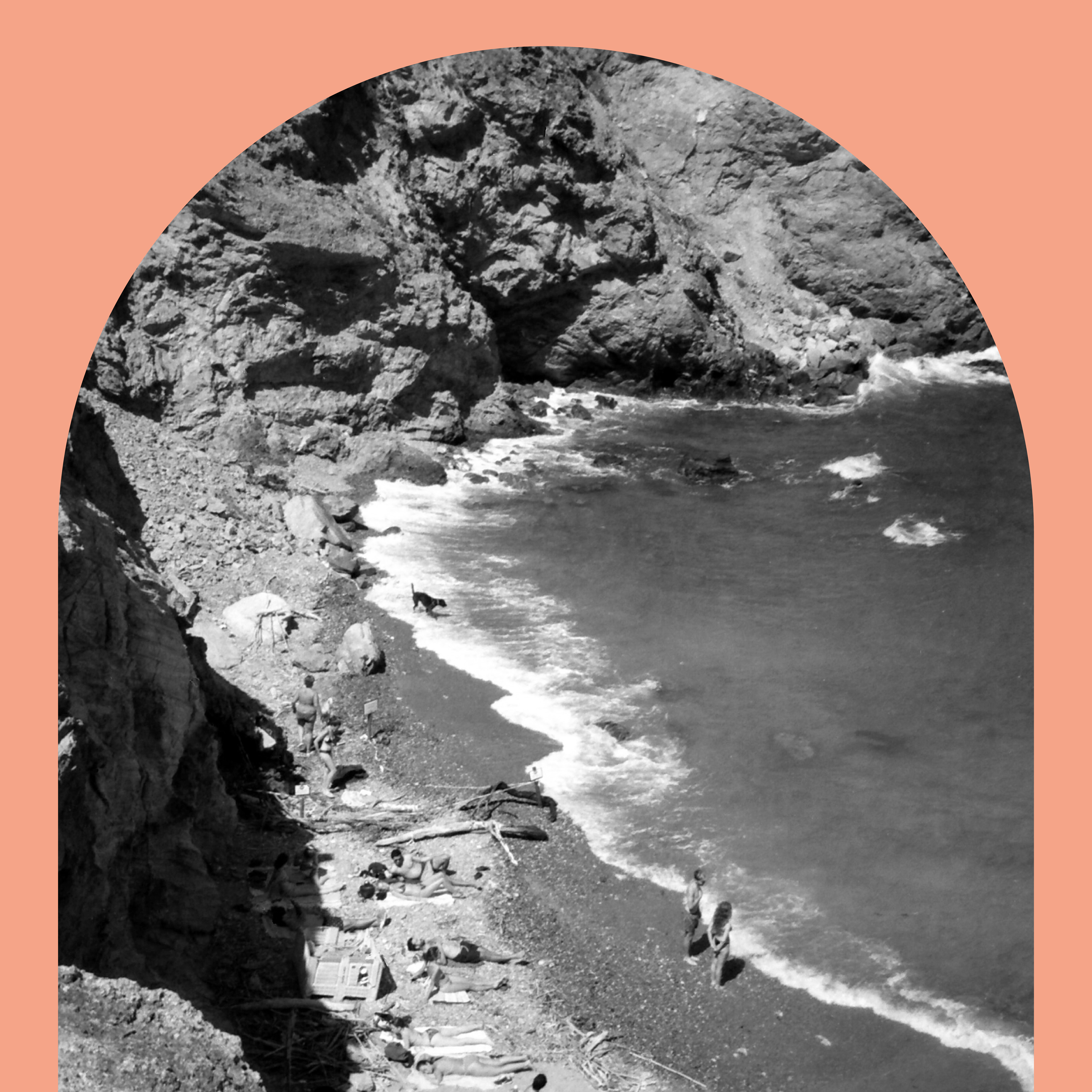
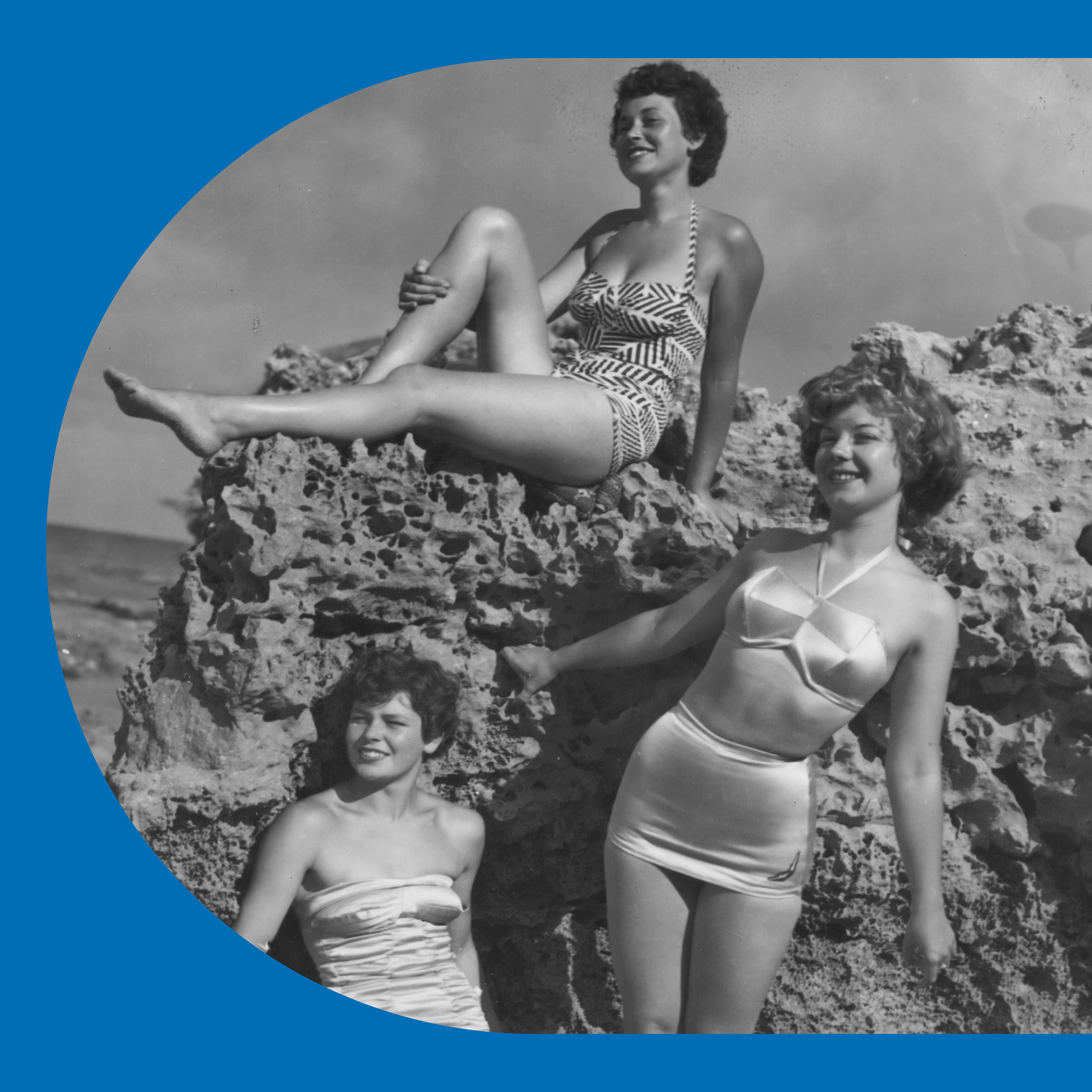
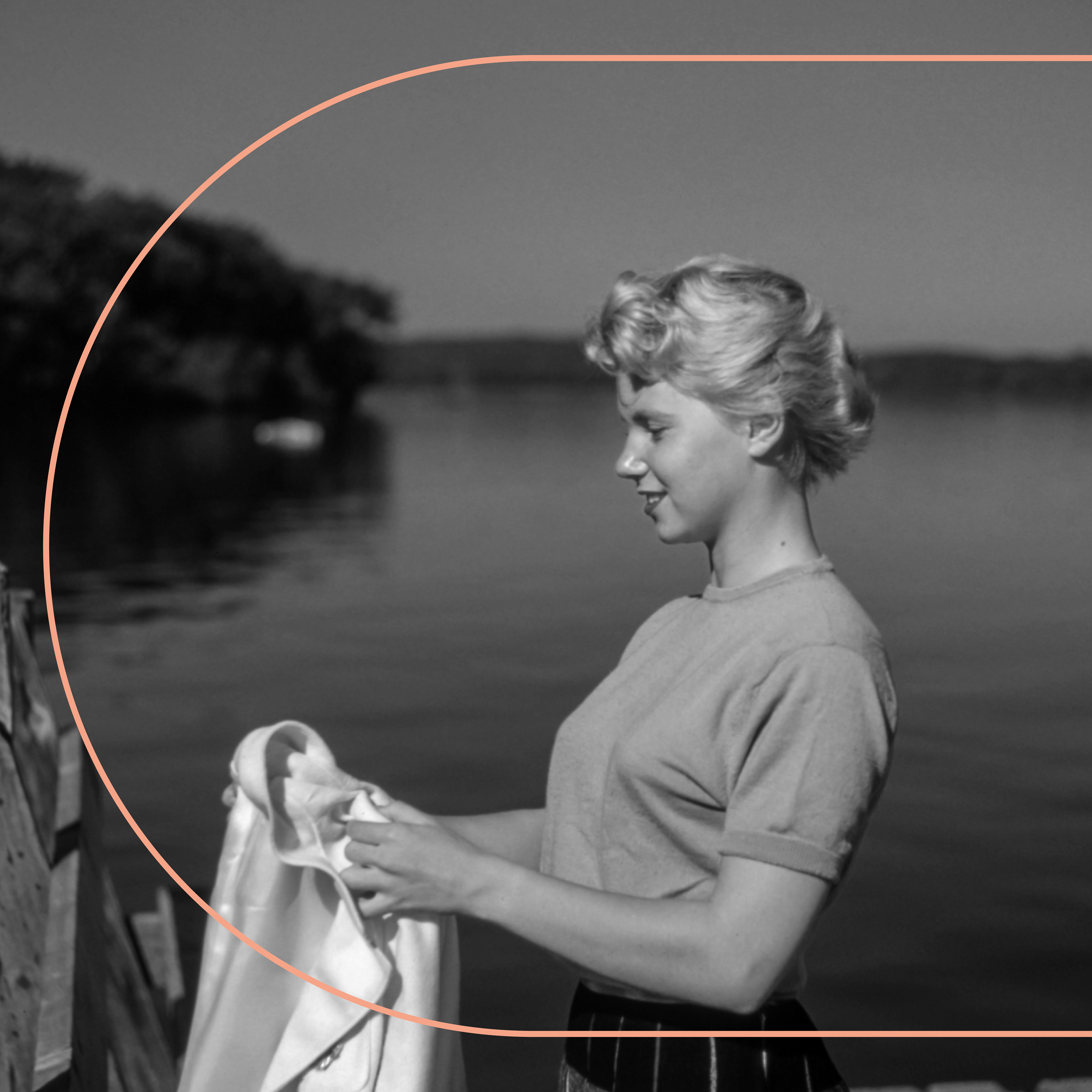
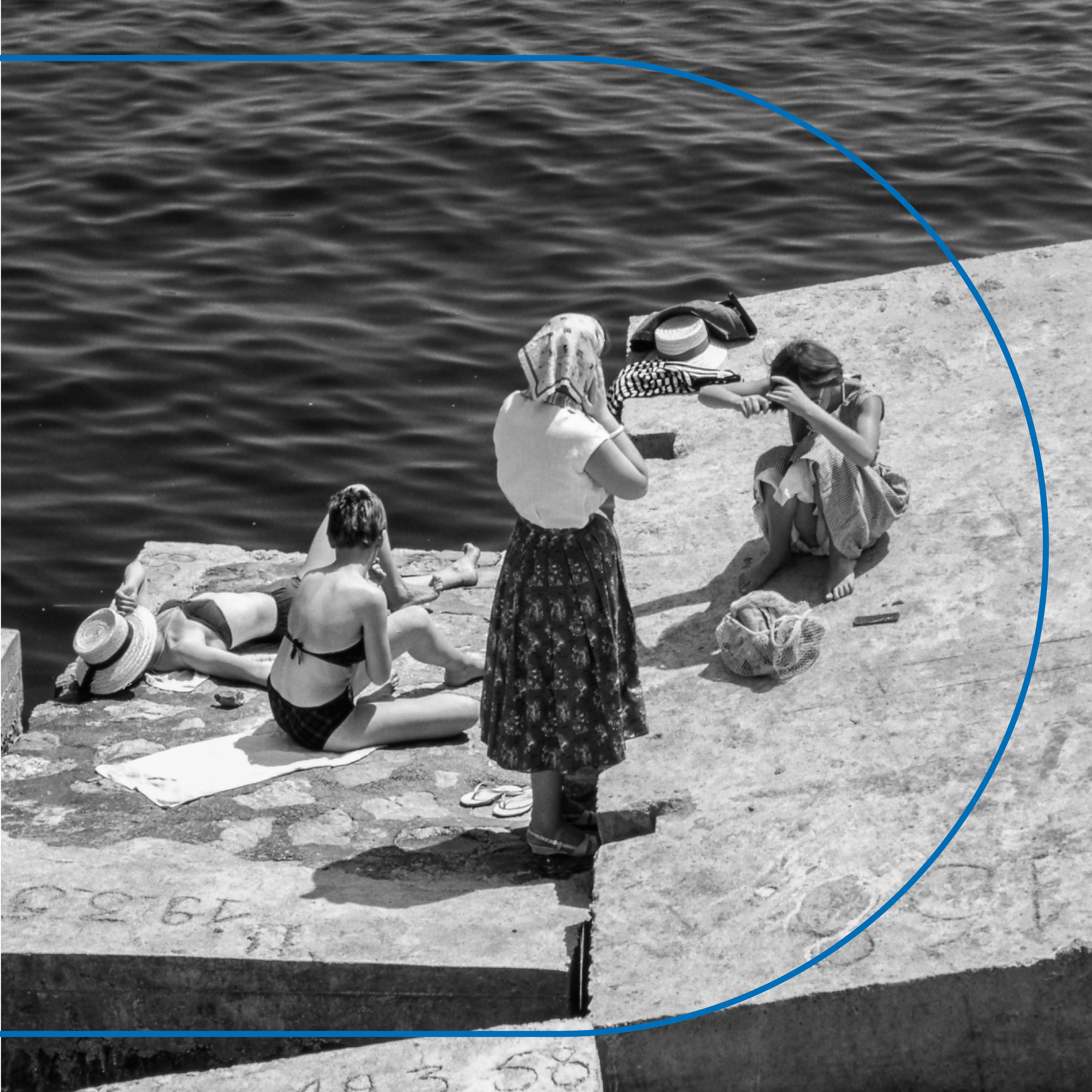
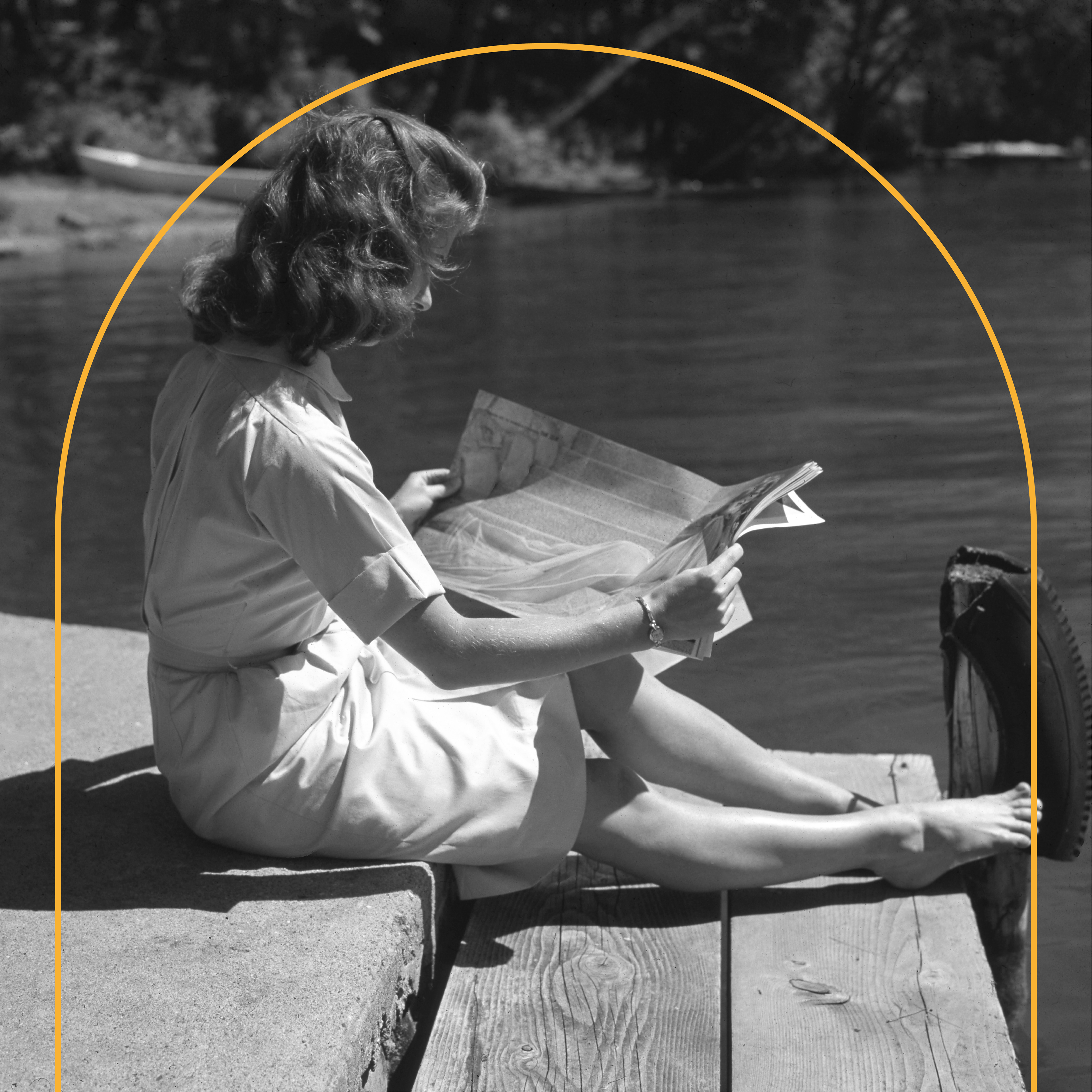
Photography style
An elaborate photographic style was vital to the brand identity since Lira i Arild wanted a way of presenting their artist and musicians, without losing themselves. Once again, the style is inspired by the location and vintage editing and motifs you flirt with the cultural history of the summer paradise. The stock photography showing in the images above was later meant to be replaced with their own, but the stock photos could also compose as a decorative part of the social media communication.
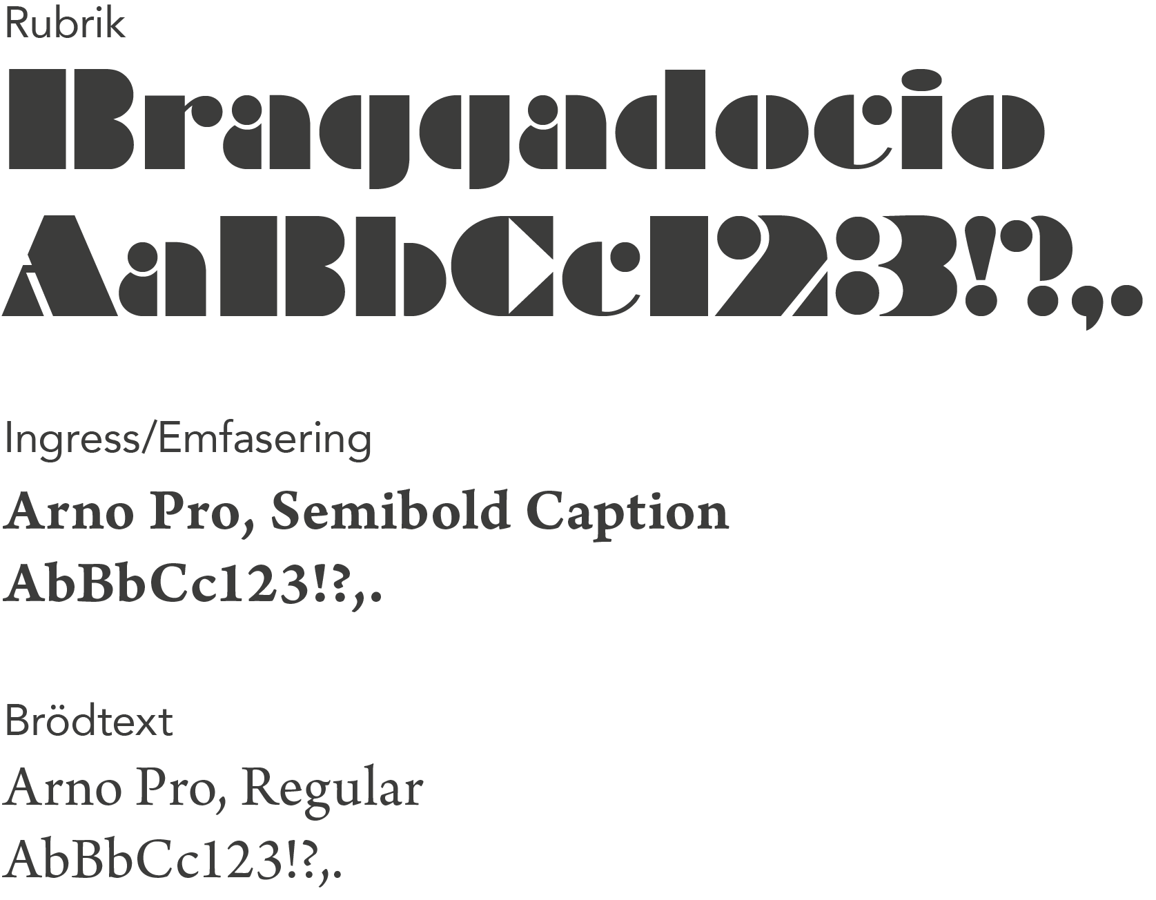
Fonts & Typography
The fonts and typography has a simple hierarchy, while maintaining the playful, vintage style that goes throughout the entire brand identity.
VISUAL Guidelines
Poster
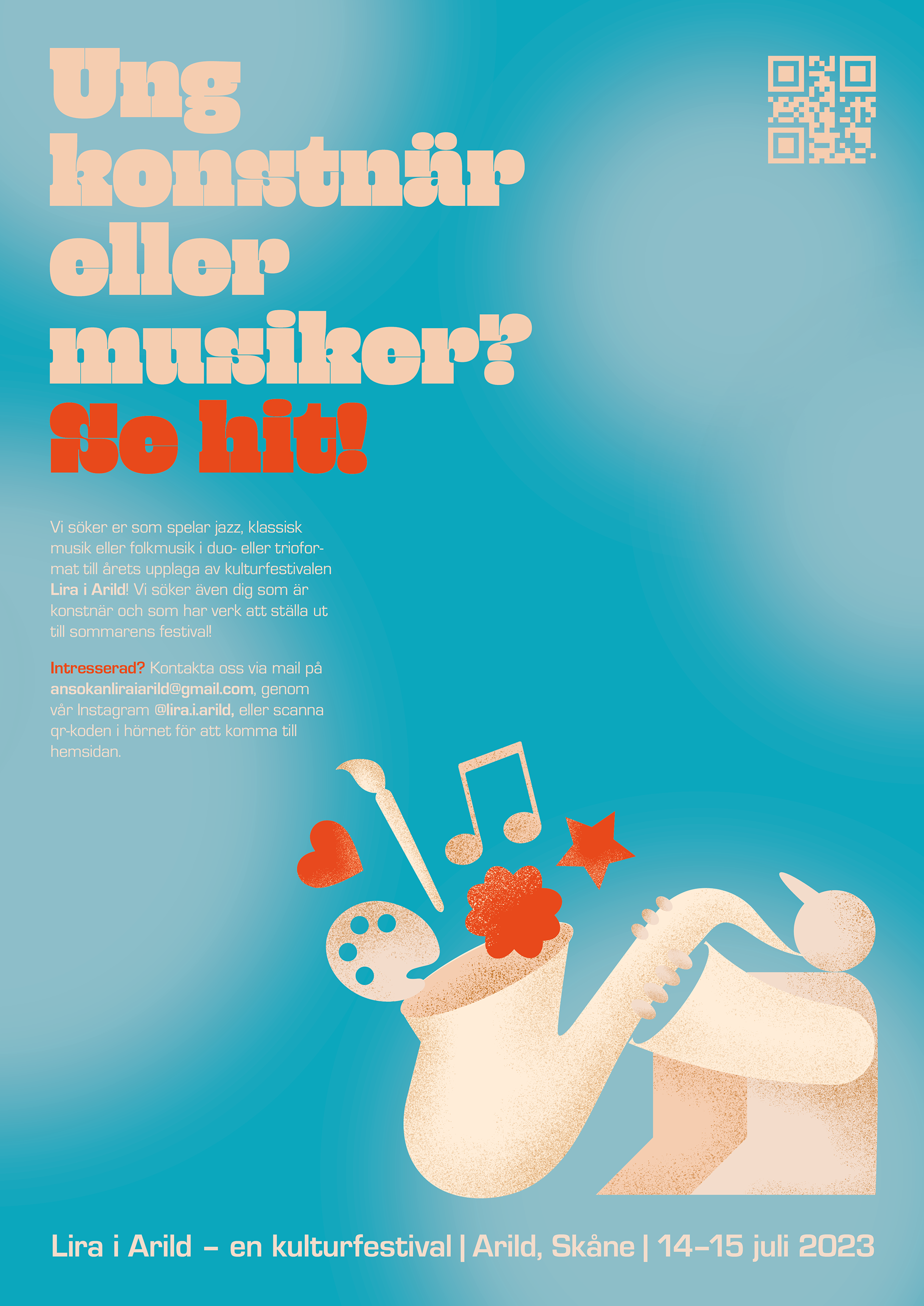
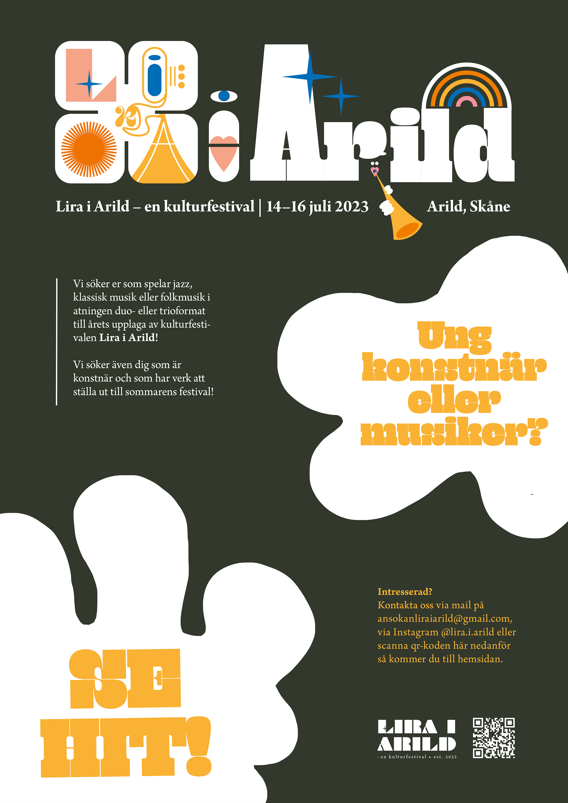
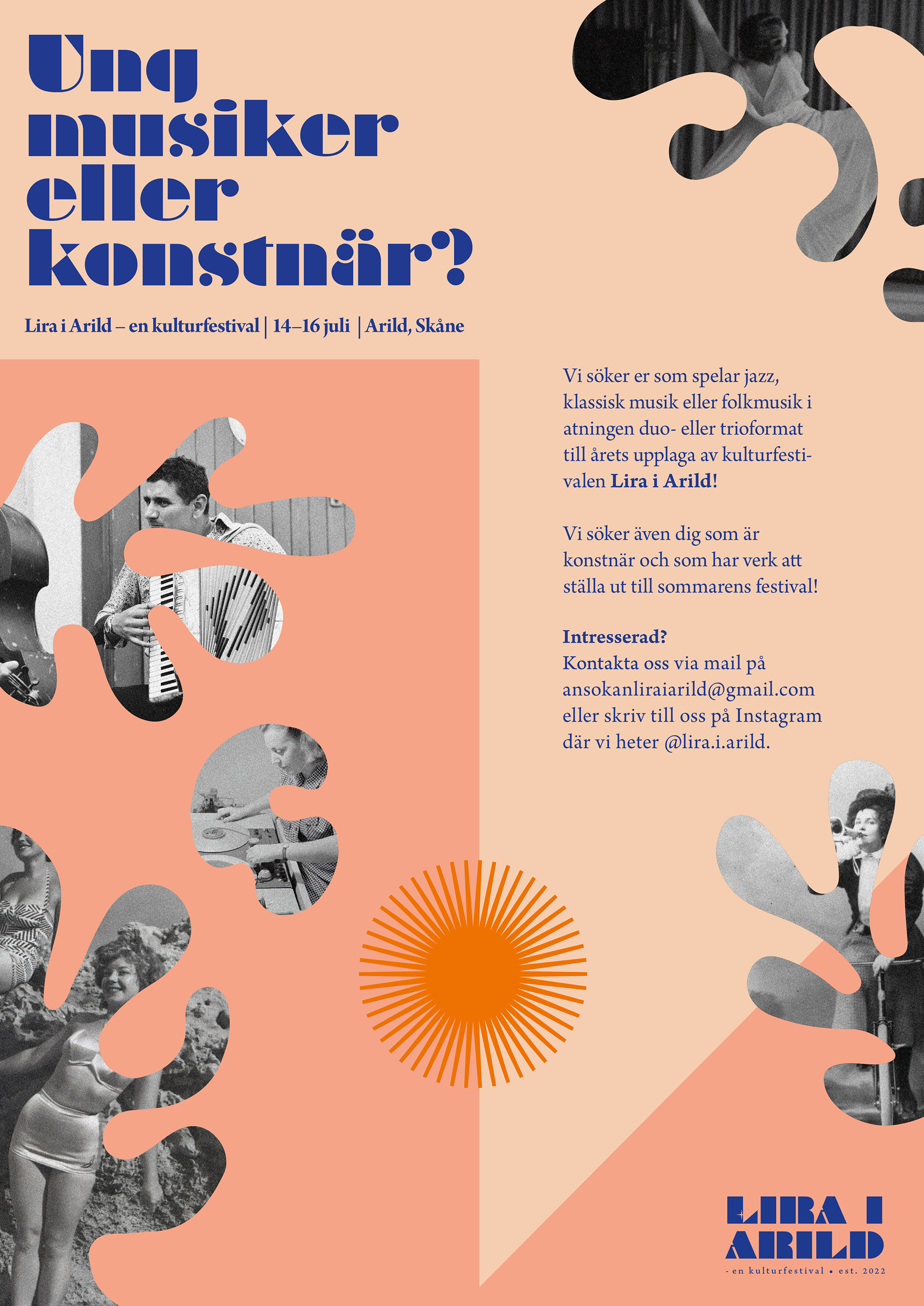
With all parts of the brand identity included, a poster targeting young musicians and artists was made. The poster was printed and advertised to the music and art schools in the south part of Sweden, inviting viewers to apply to Lira i Arild.
Rejected designs
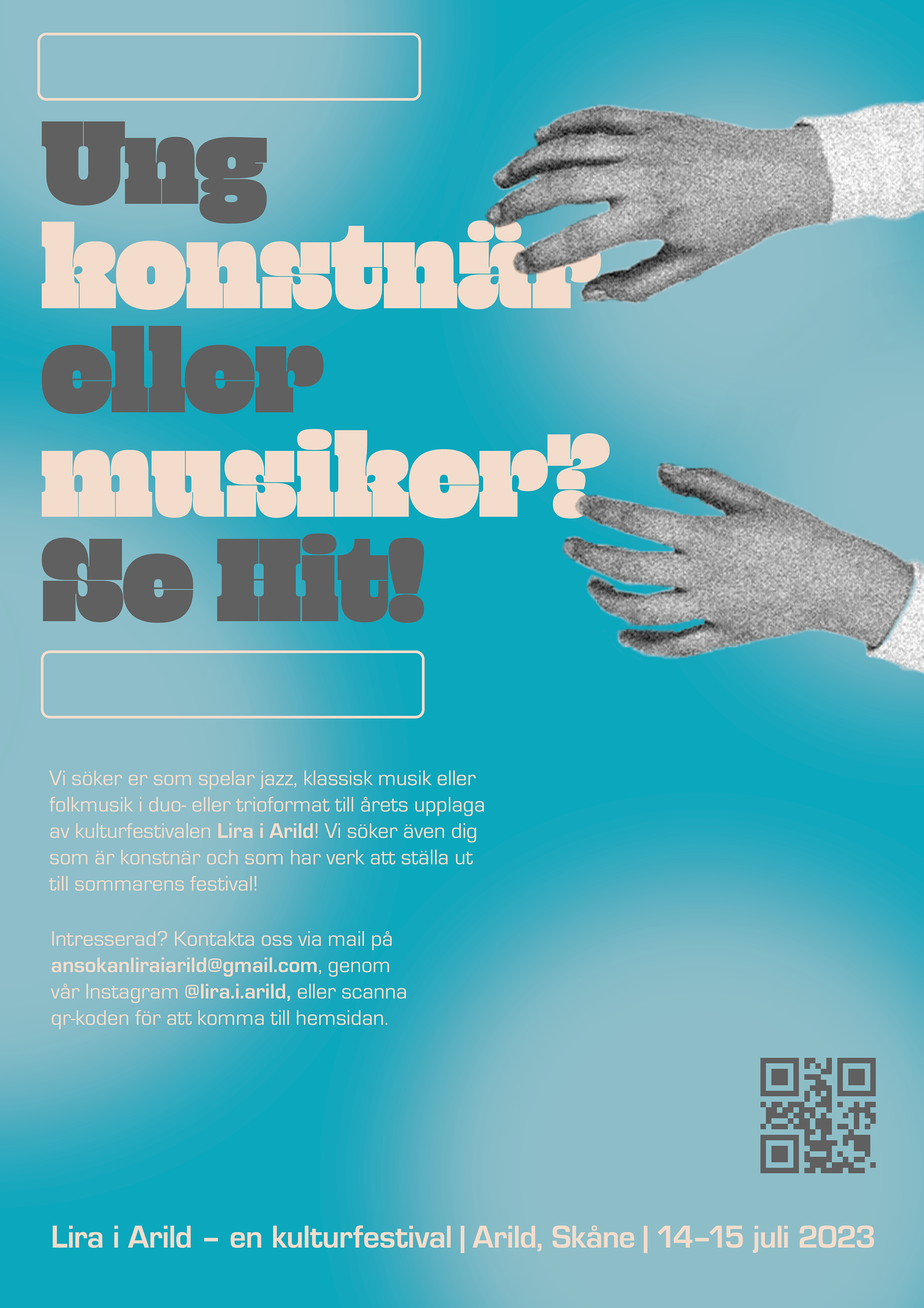
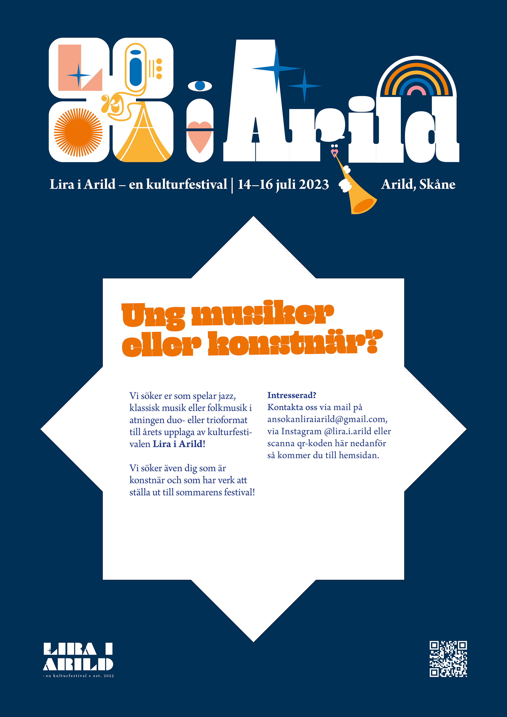
Lastly, the brand identity was carefully weighed and constructed, and had a long path of rejected designs and styles along the way. Here are a few of the rejected styles, containing the same connotations and based on the same brief – but that just wasn't the Lira i Arild identity the founders visualized.